Wednesday 7 May 2014

Concept Art: Trollbella's final piece

Like with my Red Riding Hood final design, I have also started with thumbnails to give myself more variety to choose from. 
In this scene I want to show a complete contrast in mood but not be so scary that it wouldn't be shown to children. Trollbella takes a liking to one of the main characters 'Connor' and i wants to show 'Trollbella' in a charming light to contrast with the spooky atmosphere.
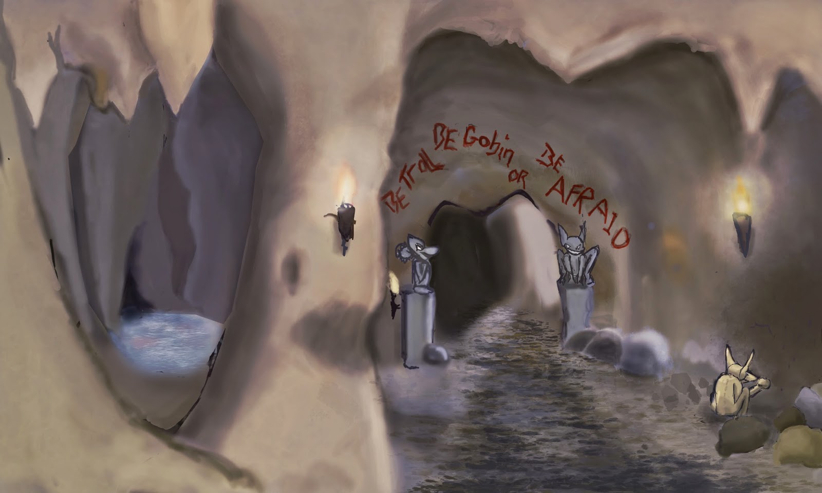
After creating my first environment with red i started enjoy the challenge of creating an environment without much organisation like in the hallway of the place.
Before adding my characters i thought this background could stand out by itself unlike the hallway scene where it seems to depend on the character. so i have added this image to my portfolio as a sole environment.


in this final scene i needed it too seem darker so that the environment looks scarier and in turn makes 'Trollbella' look bright and interesting. I knew that just making i the scene more black wouldn't work as it would just make the environment smaller so i looked at other pictures and cartoon films to see what they had done to darken their scene. luckily I found that adding a dark purple/blue lightly over top gave the intended atmosphere without making it too scary.
Overall by doing this scene last I seemed to understand what went wrong/right with queen reds scene and was able to develop the skills i had learnt.

Tuesday 6 May 2014

Concept Art: the development and final piece of ' Queen Red Riding Hood'

 while doing this scene I have come across two difficulties, firstly is the composition of the scene which was pointed out to me by my tutor who said that the vanishing point should never be on the edge of a page as it distorts the scene. taking his advice i enlarged the page and placed the vanishing point a bit more left enabling me to add the other side of the hall. overall i think this drastically changed the composition and looked more pleasing to the eye.
the second problem that occurred was with the hands as I kept getting comments on the size of the hands and that they didn't look feminine enough. i have struggled with specific problem for a couple of days now and have decide to see one of my family members who's an artist to give me some immediate advice.
After spending the afternoon with my relative we came to the conclusion that the former pose wasn't working even though we spent an hour or so working on the pose we had to change it as it seemed to cause many problems.
we talked about different poses which would beckon the audience to her, we looked at a variety on Disney film clips to get an idea of movement and different poses. so we settled on this pose which shows her being welcoming.
We kept the hands less detailed so they aren't so distracting as I want the viewer to be attracted to her face.
In conclusion I have had to make a few changes to this piece of artwork but i think its for the better the only thing I would change is the colour of the walls and roof as i think it can be seen as distracting from the character.